I have recently been to the Gift Show in NYC, various NYC retail stores, and my usual trips around the Internet. During these travels the prominent color I have seen is blue. The shades vary. I have seen cobalt, Mediterranean, faded navy and more. Mykonos blue from Pantone and Danube from Sherwin Williams are good examples of the blues being used. Here a few I have seen.
Pillows from Design Legacy. The shades of blue mixed with orange is a great for spring combination.
Design Legacy used blue as a background to highlight their product line at the gift show.
I took these photos in the furniture department at Bloomingdales. Blue accents were everywhere.
New fabric from Designers Guild.
A window display at Bloomingdales featuring new dinnerware from Scalamandre. The brilliant blue of the Paradiso/Avalon silk fabric on the wall creates a stunning back drop.
New lighting from Jamie Young showcases a mix of blues.
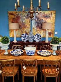
A stunning blue setting from Mecox Garden.
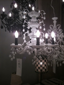
The white chandelier seems to be everywhere. . This stunning light is from Canopy Designs.
I am over the top for white chandeliers. Love them.
What colors are you seeing and using?


Thanks for sharing your travels. It's such fun to see what's current in the design world.
ReplyDeleteIt was a amazing trip. Full of sensory overload.
DeleteI must be entering my 'blue phase' because I'm loving those blue pillows... and that fabric is to die for.
ReplyDeleteCyndi
DeleteI really do love these shades of blue. They are easy to live with and mix with other vibrant colors.
Vicki